CASE STUDY | Art Direction, Visual Identity, Brand System
MHD — Rebranding A Safety Company For A Higher Standard
Developed a brand system for a safety company, translating updated strategy into a scalable identity designed to perform across digital marketing channels, field materials, sales collateral, and their uniform and office space.
Before
After
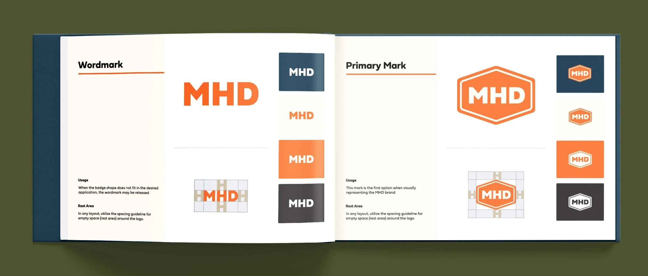
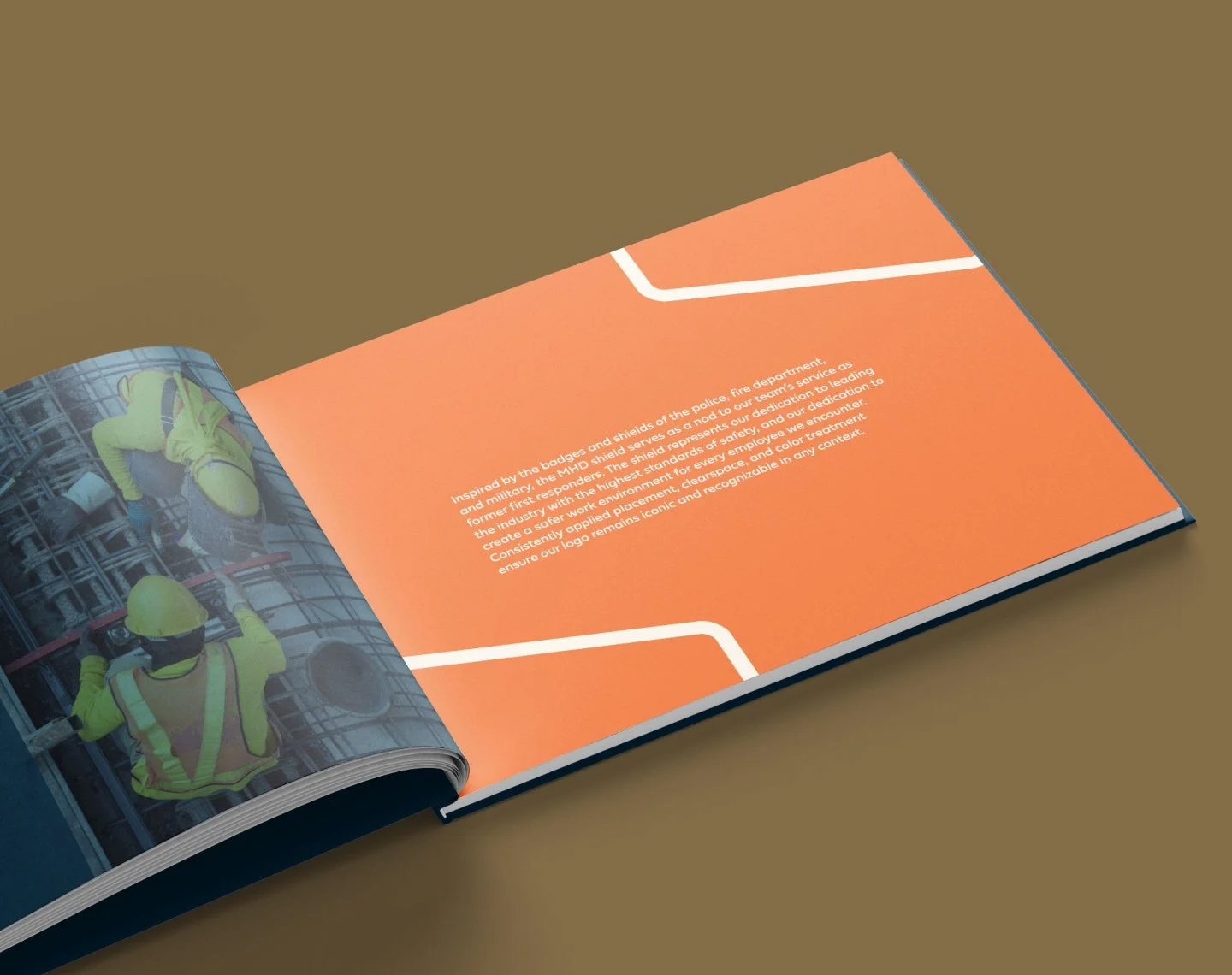
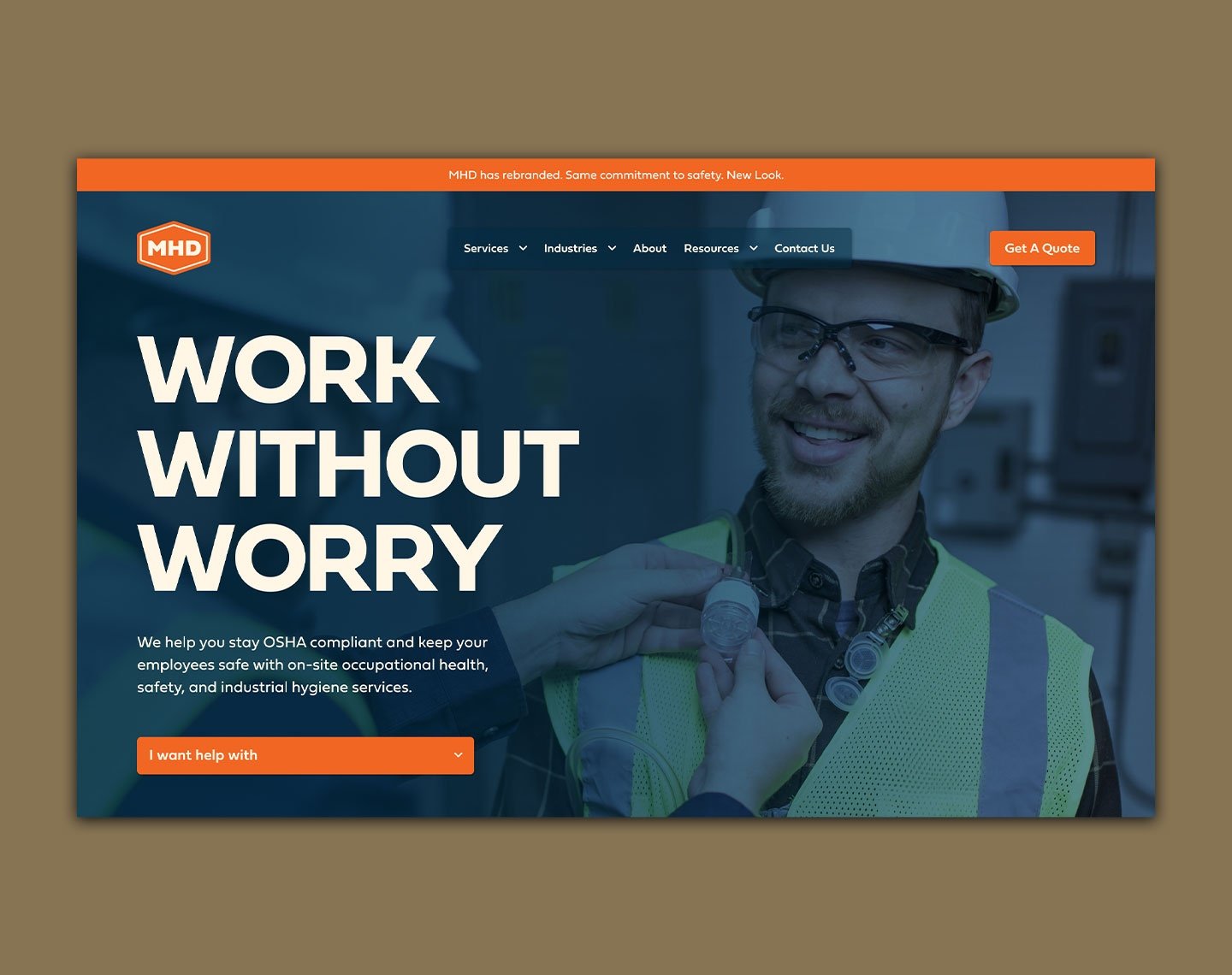
A Mark Built on Protection and Authority
The visual identity draws from first responder insignia: badges, shields, and service marks. It pays homage to their team, made up of former military, fire, police, and emergency service professionals.
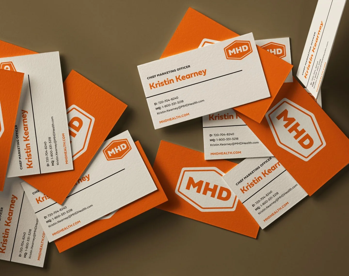
Color Grounded in Safety. Inspired by Service.
Navy for trust + authority

Orange for emphasis + action
Cream for clarity + balance
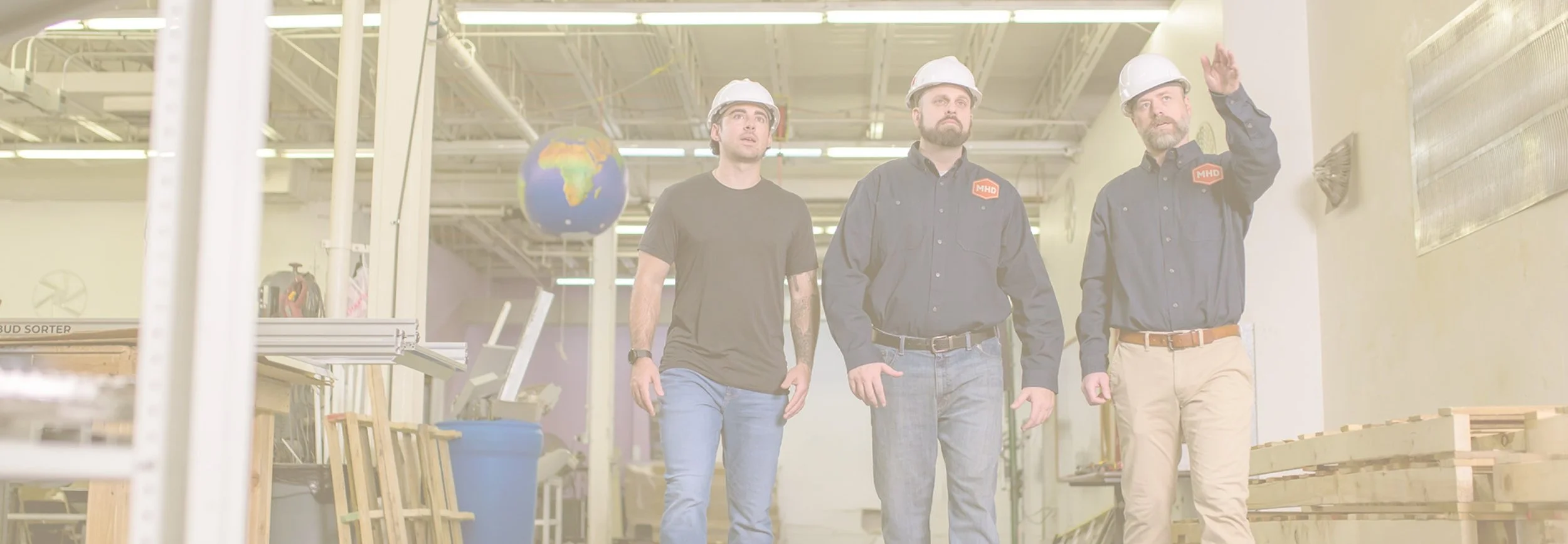
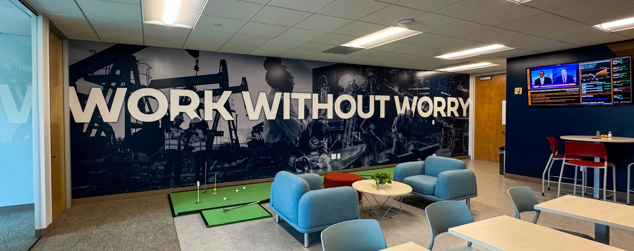
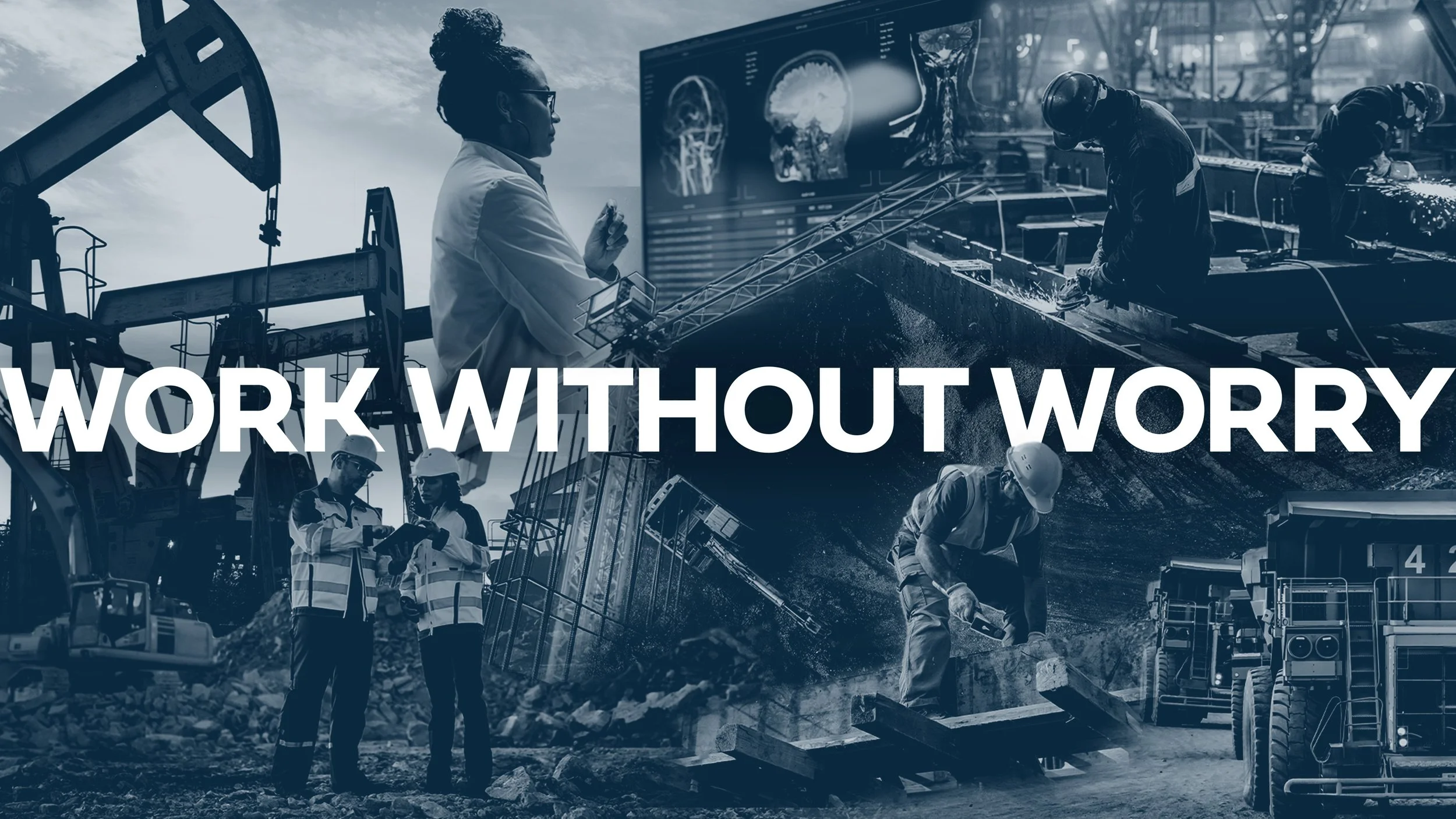
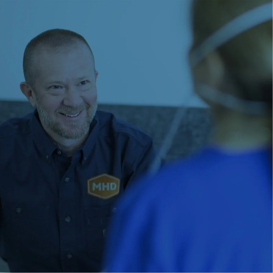
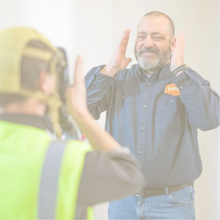
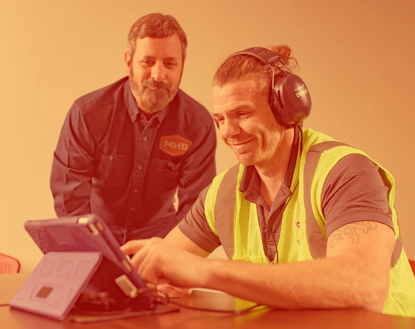
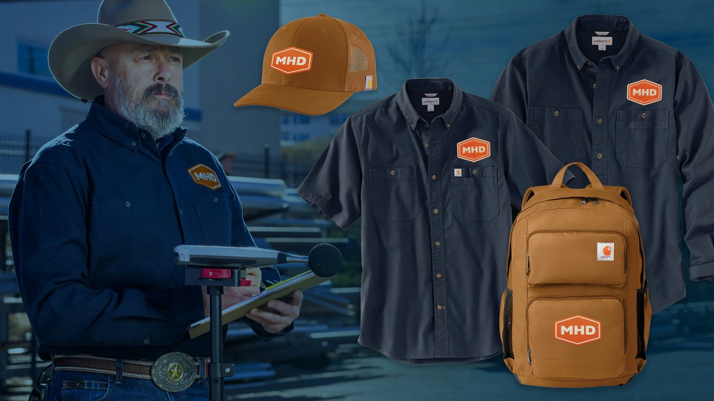
Real People. Real Work.
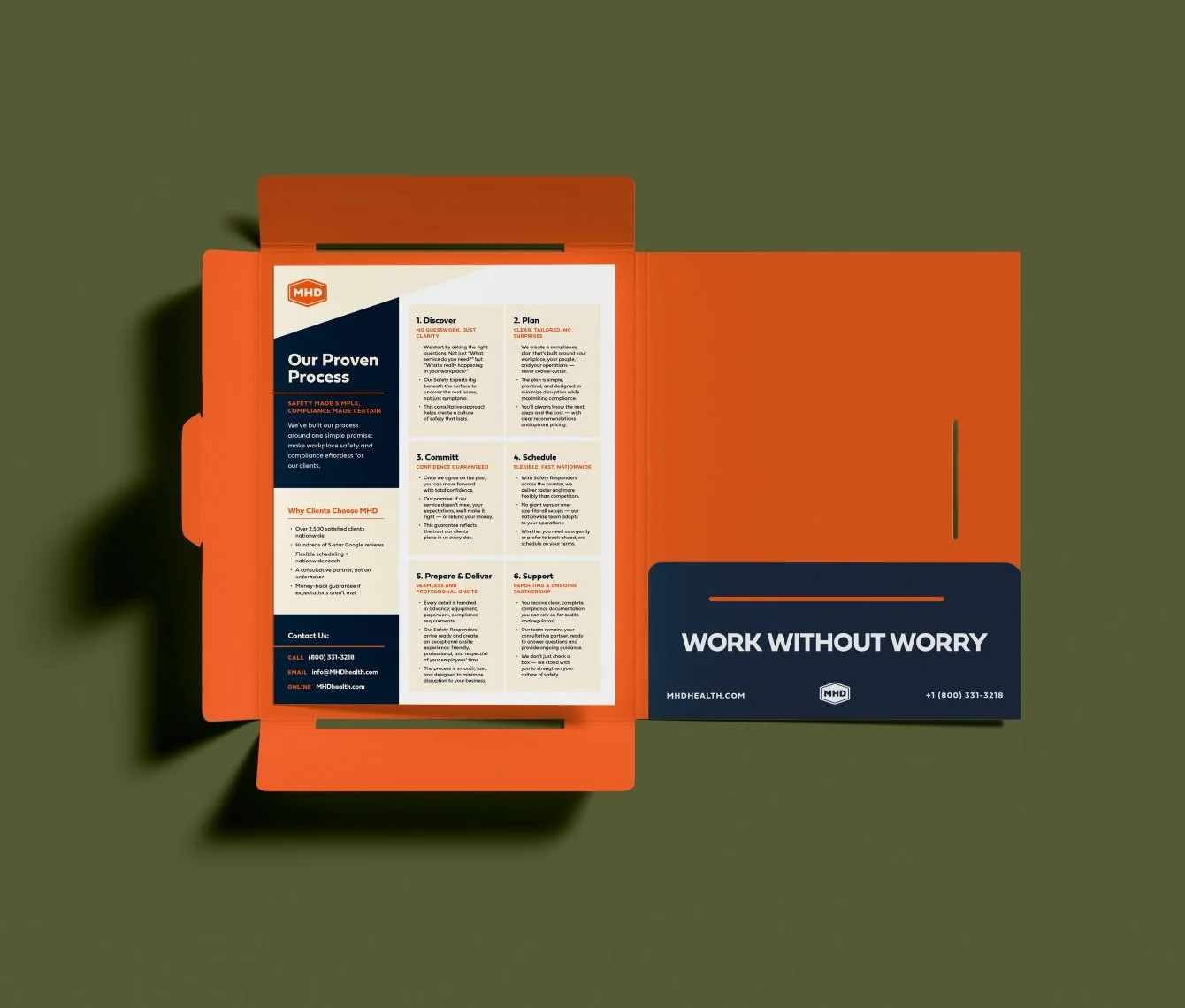
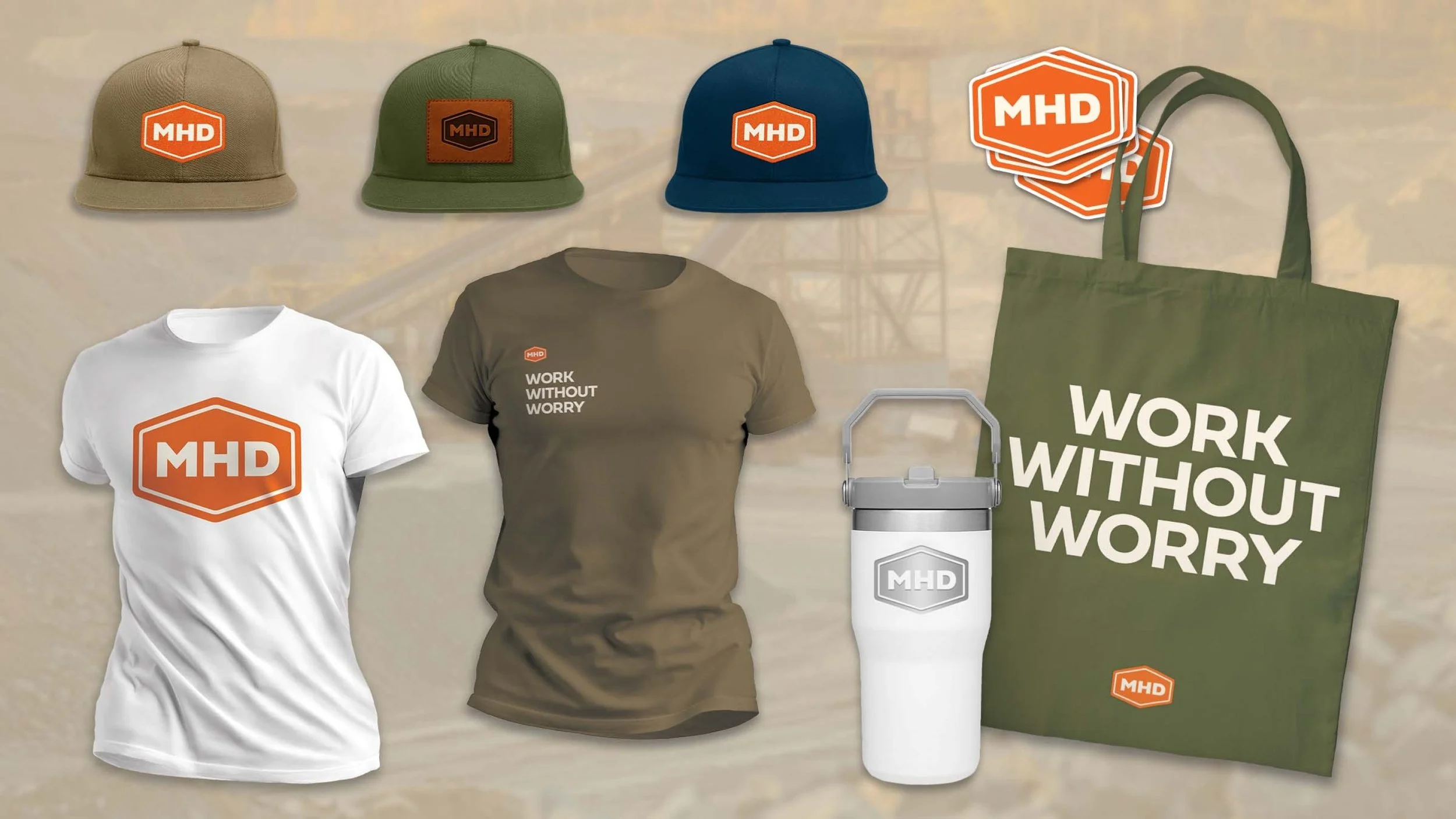
The identity was designed to perform across high-use environments, from uniforms and field materials to sales collateral and digital touchpoints.
Built for the Real World.
Photography focuses on authentic environments and technicians in action. Color overlays are used selectively to create structure and reinforce the brand system.
The balance is intentional—grounded, but refined.
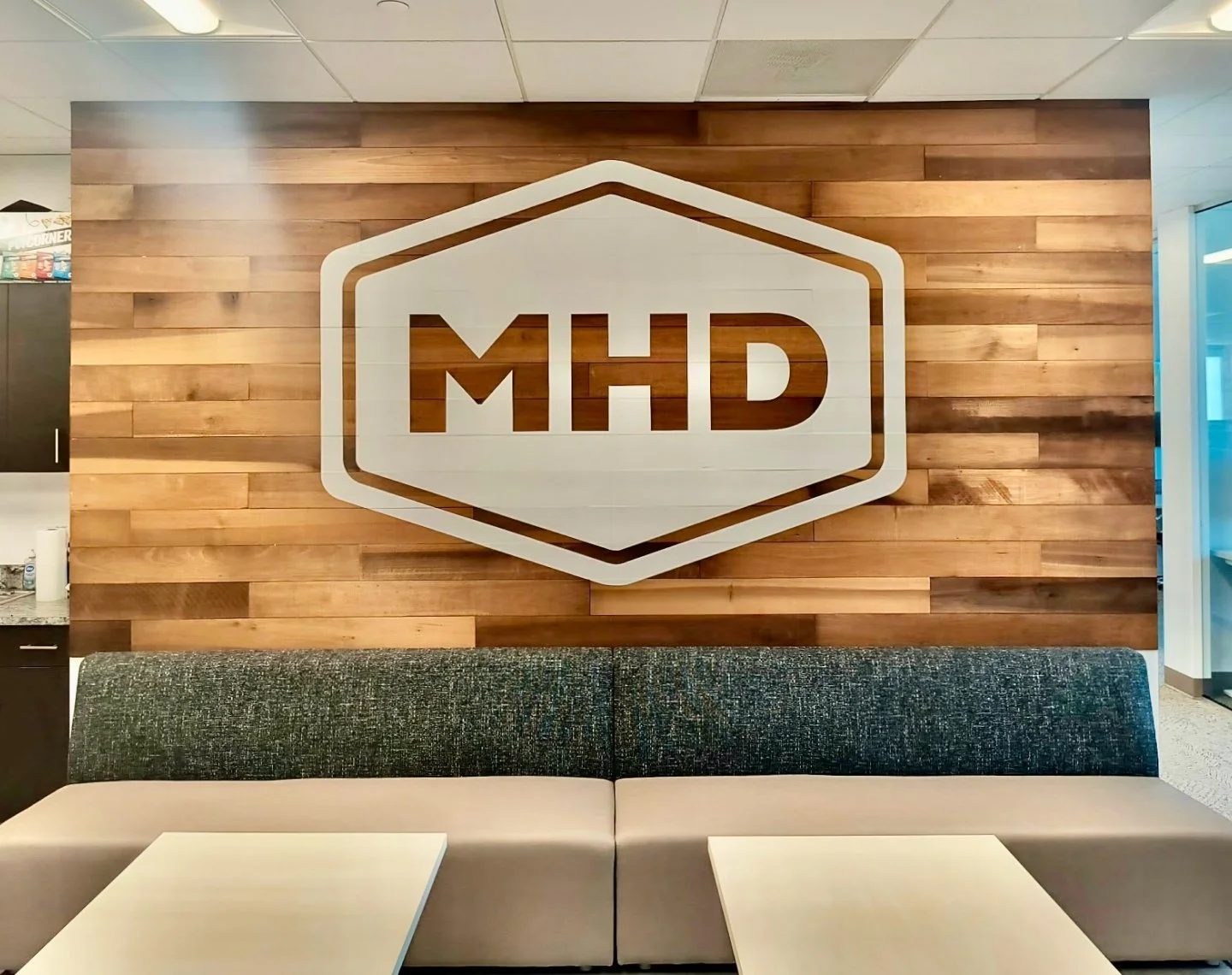
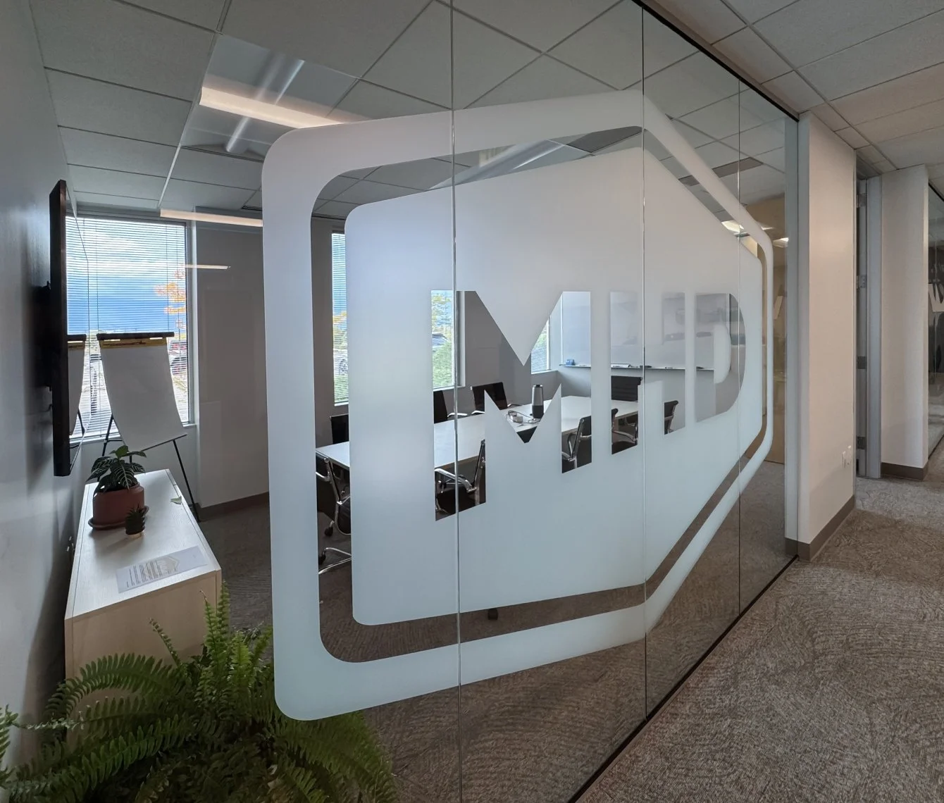
Bringing the Brand Into the Office
The identity extends beyond digital and print into the physical workspace. I applied the logo to the conference room glass, creating a bold, architectural brand moment. I also redesigned the breakroom, including a custom collage mural, and developed a large-scale mural for the cubicle area—turning everyday spaces into cohesive, branded environments.